Starbucks is a place of worship for coffee growers. It is a chain of cafeterias-coffee shops, with more than 17,000 establishments spread over 49 countries. Some people go through the cities looking for their logo to sit on a sofa and browse their wifi enjoying a great cup of coffee.
However, its logo has not always been as we know it and, in fact, it has undergone great changes since its creation in 1971. In fact, those who only know the modern logo and have surely wondered who this woman is, and what she has in hands, History has the explanation for this mystery.

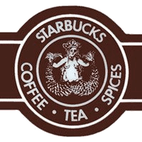
The first known logo of Starbucks (1971-1987) is the image of a mermaid with two tails inspired by an illustration of a Norwegian book of the fifteenth century. Initially, Starbucks sold coffee beans, tea, and spices, a type of far-away trade we know.

In 1987, Howard Schutz, founder of a similar business called Il Giornale, acquired Starbucks, merging both companies, and gave the logo a more stylized touch and the green color that today we relate to the brand. As it can be seen, the Il Giornale logo bears a resemblance to that of Starbucks which inherited its stars. It remained intact until 1992.


In 1992, the last retouch was given to the logo , leaving it much more schematic, partially hiding the “tails” of the siren (it is practically impossible to know what they are) and modernizing the edges and colors a bit. That is how it has remained since then until today.
Starbucks logo hides a message
Some of the things that are circulating on the internet about the issue that has created commotion in recent days on whether or not it is satanic Starbucks, each can draw their own conclusions, it can be coincidence or really the logo was created with only one intention.
It is said that freemasons see Starbucks as communicators of subliminal messages to their clientele.
Below we can see a series of variations of the Starbucks logo that has suffered over the years. As you can see, at the beginning it was so obvious the message that was intended to be transmitted according to people who see it in a dark way. Maybe at the time where according to the believers of the satanic message for lack of recourse to spread the news or little attention to this series of things or coincidences was not paid attention.
In addition, there were no social networks to make viral or spread an idea.
As you can see in the logo there is a mermaid with a forked tail and the perishing has a maleficent meaning.
But who is this evil mermaid?
She is the great harlot, the queen of the sea EA, the goddess of Babylon! You can also notice important similarities between the Starbucks logo and Astarte who is known as a demon woman Lilith who is adored by the Satanists!
Lilith according to the legend was the first woman of Adam from the ground. After having previously tried to kill Adam, Lilith was turned by God into a vampire as divine punishment! It is speculated that it is what is known as “Mora” or “” Vrachnas.
Among the symbols that can be observed are the reverted cross and the moon opposite the full one.
The colors are black and white, the ones that symbolize the masonic chessboard! A circle in another sense “a” secret society.
The inner circle ends where the hair of the siren begins. The hair is represented as a mirror of the numbers “333/333 or 666”.
The siren is used for the sign of peace that takes us back to 1987-1992. This symbol actually means the breaking of the cross, an ancient symbol that has always meant death.

